Every bite should be a joyful experience, evoking happiness and well-being.
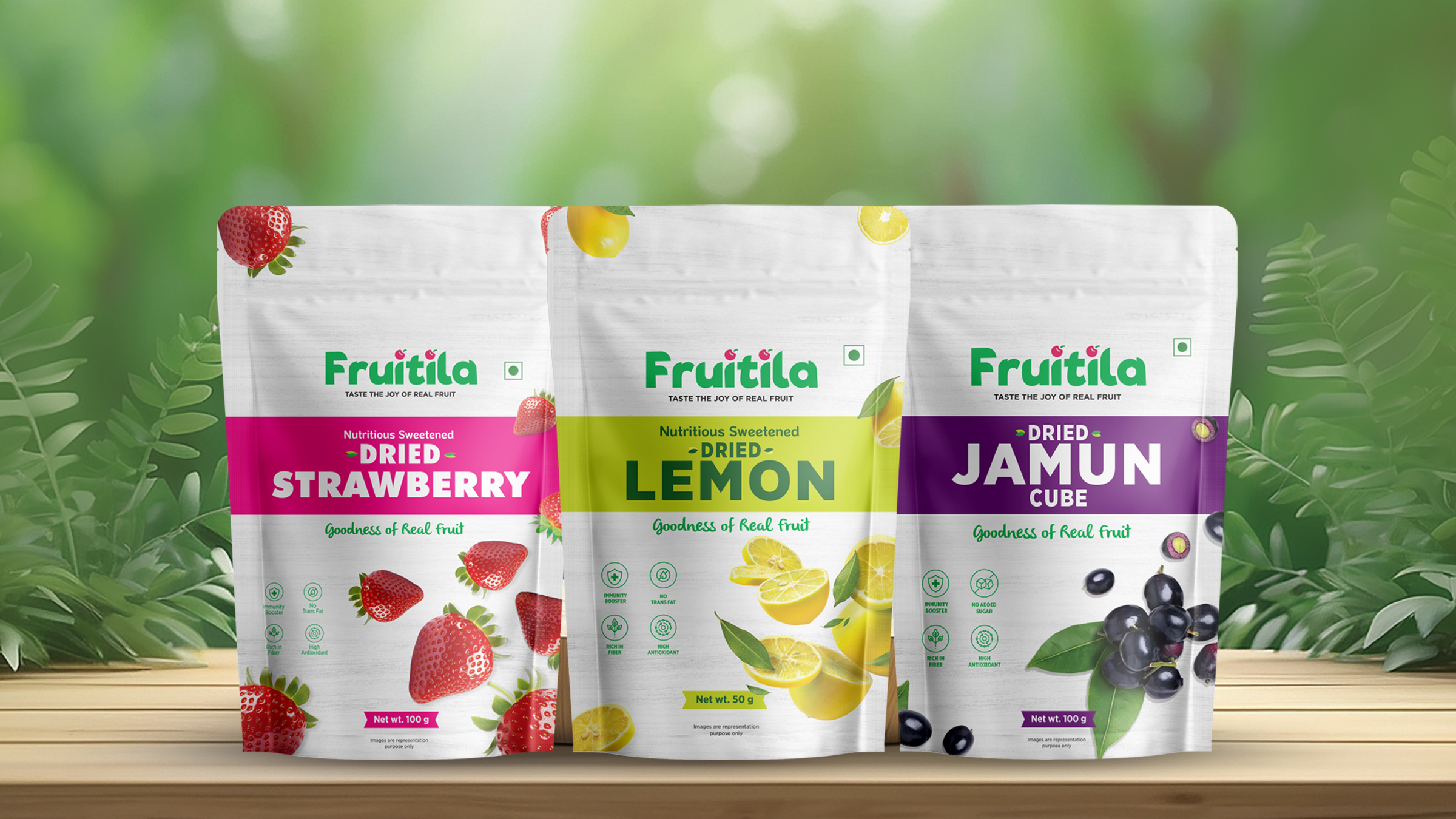
The playful typography and fruit-inspired elements shape a distinctive and memorable visual identity for Fruitila. The brand’s connection to fruit represents delight, while the round shape of the fruit element signifies wholeness and purity, reinforcing the commitment to quality and natural goodness.
The color palette and typography embody a perfect balance of elegance, vibrancy, and approachability, creating a fresh and inviting appeal. This fusion ensures that Fruitila not only looks appealing but also resonates with consumers on an emotional level, reinforcing trust and excitement around the brand.
Fruitila – Taste the Joy of Real Fruit
Our packaging embodies freshness, vibrancy, and natural goodness, making every bite a delightful experience with nature-inspired aesthetics, vibrant color coding, and clear communication, it highlights the nutritional benefits while ensuring convenience. Designed for freshness and appeal, Fruitila brings the joy of real fruit straight to you!